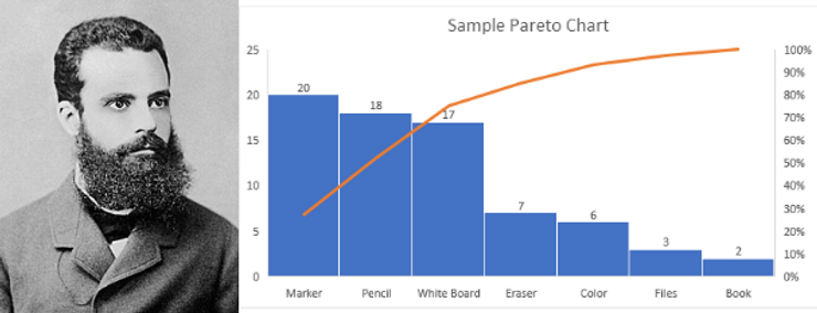
What is Pareto? History of Pareto Chart & How to Make Pareto Chart In Excel: The Pareto chart is a combination of line and bar graph charts that indicate the frequency of the defects, as well as their cumulative impact. In every industry, we use Pareto to prioritize defects.
What is Pareto? Definition, History & Examples: In the Pareto Chart each bar represents the defects of the products and services and at the same time the line chart has shown their cumulative impact.
Why the Pareto Chart? What is the Pareto Principle?
The Pareto principle says that 80% of the results are determined by 20% of the causes.
In other words: Roughly 80% of the effects come from 20% of the causes.
History of Pareto Chart, Pareto Concept
The Pareto Chart, Concept, and 80-20 Principle were introduced by Italian economist Vilfredo Pareto in 1897.
He was the first who discover that income flows through a Pareto distribution, which is a power-law probability distribution.
The Pareto principle was named after him, and it was built on observation of his such that 80% of the wealth in Italy belongs to about 20% of the population.
His legacy as an economist was profound.
Examples Of Pareto Charts? How to make a Pareto Chart?
With the below-mentioned examples, you can learn how to make Pareto Chart in Excel.
Step 1: First create a data table from your database. (Your database could be your Quality Evaluation Sheet, Your Check Sheet, or anything on which you're collecting data on your process.
Make sure your data should be in upper to lower value (Largest to Smallest).
Step 2: Select all the data (Stationary Type + Defect Count). Click on the Insert tab on your excel workbook.
Step 3: Click on the Pareto chart
Result: This is the easiest way to make a Pareto Chart.
Note: After getting the result of the Preto Chart double click on the chart title and mentioned the chart title as per your requirement.
Then click on the chart border and you can see the + (Plus) Icon. Click on Plus Icon and check the box for data level.


